Role: Lead Service Designer Team size: 4 people internally – 10 people at large Extent of the project: 6 months full-time
🧘🏻 Background
AIFA, Agenzia Italiana del FArmaco, is the Italian national drugs administration. Under the Ministry of Health, it manages and regulates the whole pharma market in Italy.
The website has more than 12.000 contents and it’s published at: www.aifa.gov.it
Press Office’s staff faced daily a platform which grew without a defined path: their concerns were related to basic functions, like uploading an image without errors.
The political management set the deadline for a new homepage in three months, focusing on a new appearance and making everything accessible to the citizens.
🪤 Challenge
How might we engage employees and managers into a co-design process, to understand and challenge a complex, technical and multi targeted organisation?
How might we make each piece of information of their own knowledge accessible and understandable to every citizen?
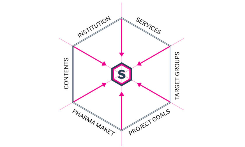
🎢 Strategy and process highlights
Shaping a vision through benchmarking
AIFA had no other body to compare within the Italian market.
Website’s structure was compared to a benchmark of European drugs agencies. Content with the best ranked Italian websites with medical information.
The approach grounded on two aspects: providing new perspectives to agency’s team members and understand agency’s structure and outcomes.
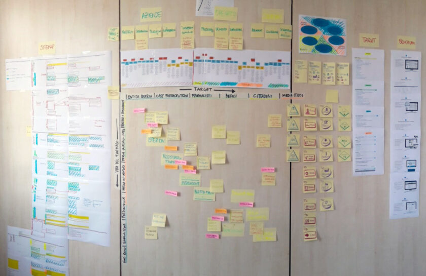
Initial phases of mappingThe solution balances across constraints
Visualising complexity to frame the problem
Mapping and understanding the stakeholders scenario made connections emerge across the agency’s activities, target groups and outcomes
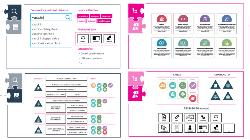
Hijacking the service blueprintformat to visualize and interconnect content, activities, target groups and user paths, stimulated the co-design process.
Nine macro-categories were identified, capable of housing all contents overcoming the pre-existing taxonomies.
Problem framed
A content architecture based on targets and departments made the website huge and unusable. We got to overcome the existing taxonomies to understand data from the benchmark and define a new flexible architecture designed to grow.
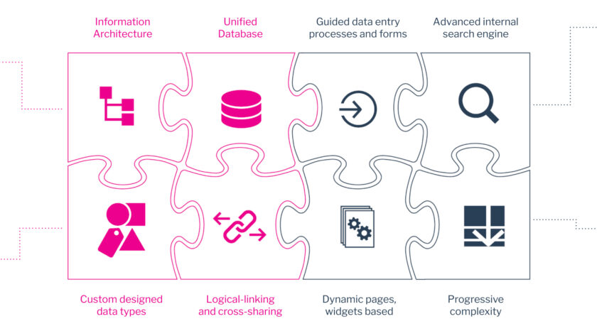
Setting foundations with meta-design
A puzzle of components visualised years of unchallenged problems, both on technical and service levels.
We delivered aset of design principles for the new website and to serve as direction for future developments.
A new system architecture, cross-database data aggregation, progressive web-pages were defined, involving developers in the co-design process.
The puzzle of meta-design componentsSome detail slides showing various aspects of the solution
Co-design UX and content with gamification
Designer’s Italia design system sped up the UX/UI design process. Only few custom elements had to be designed ad-hoc.
A “gamified prototyping” tool, printed versions of UX elements, made the press-office team to quicky adopt the new UX features and capabilities.
Primary UX testing and internal training over the new CMS were both performed using this tool.
🪄 Plot twists
Hacking the service blueprint leading to a macro-categories-based structure.
Page with progressive complexity avoided target-based architecture.
UX/UI gamification allowed the agency team to overcome pre-existing constraints and process flaws.
🍻 Failures and learnings
Strict deadlines and political prioritisation affected the visual quality of some UX components and limited the adoption of advanced features.
The flexibility and scalability of service design tools provided constant agile sprints, maintaining a constant workflow and respecting deadlines.
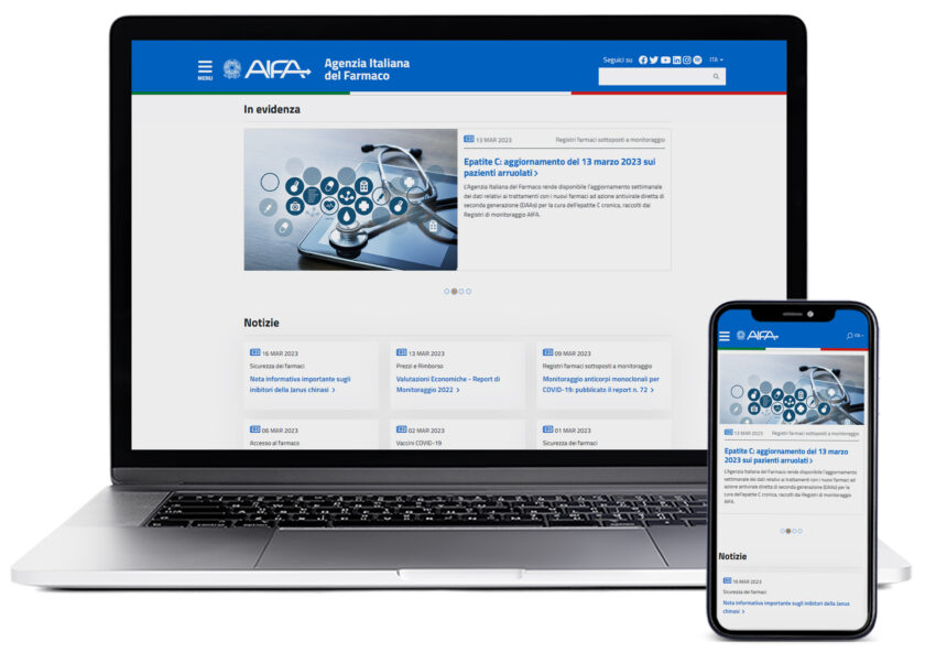
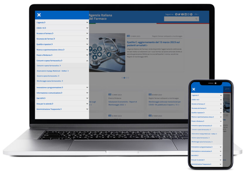
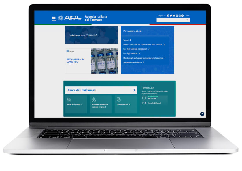
The home page structureMacro-categories displayed in the main menuAn example of custom designed components