Rolls-Royce is the world's leading manufacturer of boat propellers, aviation engines and power-plants turbines. It features a strong worldwide presence and a defined hierarchy of production plants and corporate offices.
Role: Service Designer + Web developer
Team size: 4 people
Extent of the project: 3 months full-time
🧘🏻 Background
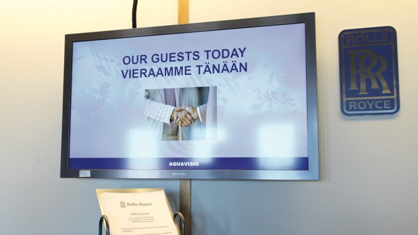
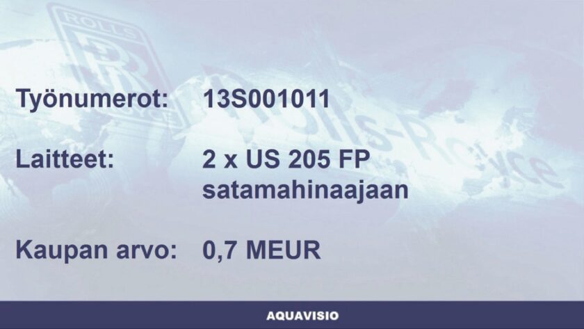
Aquavisio is the Internal Communication Channel of Rolls-Royce’s factory in Rauma, Finland. Information is delivered through screens placed in both offices and production plant buildings and covers daily visitors, new contracts, IT/Safety bulletins and more.
We were asked to improve the current solution making it more engaging as well as shape a brand-new solution to serve as a vision for near-future developments.
🪤 Challenge
How might we bring more engagement to Aquavisio system, improving news and updates awareness on multiple locations and to very different target groups in terms of roles, priorities and languages?
🎢 Strategy and process highlights
Understanding and framing the problem
- The research process started o understanding how the current system worked. It was based on a software developed locally, and there was no standard across Rolls Royce plants.
- The person managing it wasn't really open to communication: we felt that she may have feared that our intervention would have made her task more difficult to perform. It was a challenging interaction.
- On the other side, we interviewed managers to understand the structure of Rolls Royce company, the interactions between plants and departments and all other information to see the design field from a wider perspective.
Problem framed:
The system design is unappealing, overloaded and repetitive. Information must be simplified and rearranged with a wider perspective, providing targeted feed based on locations and targets.
Testing engagement with a new interface
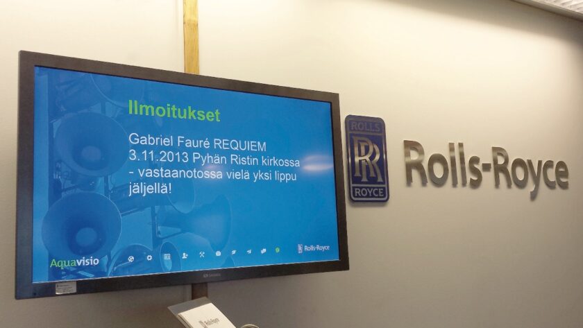
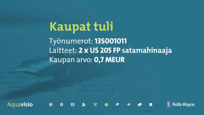
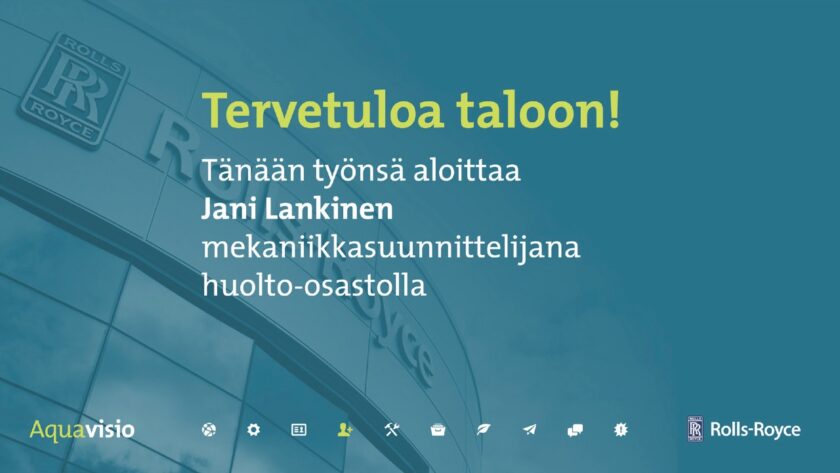
- Ensuring that our design was in compliance with the brand guidelines every step of the way, we made the appearance of Aquavisio uplifting and attractive: we selected background images providing a relation to the category which was being screened, leaving the whole screen estate to content.
- We included a timeline at the bottom to provide a sens of order and sequence to the flow of information; this also worked as an index go understand at a glance the kind and amount of messages that were part of the daily newsfeed.
A new identity and logo for the Aquavisio system was released as well. - Completing this redesign at first outcome of the process brought a significative improvement in interaction on any level of the Rauma plant employees: even Aquavisio's manager was impressed by the job we made and started pushing forward for new developments.
System thinking: dynamic contents in a corporate scale
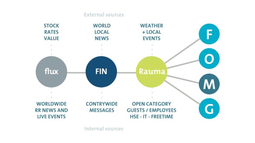
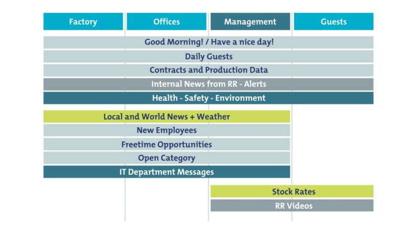
- It was time to channel the acquired value of engagement towards a new vision, adding two sub-values: connectivity and communication. We envisioned flux a new system, dynamic and interactive, with a proper content schedule, target groups and hierarchy.
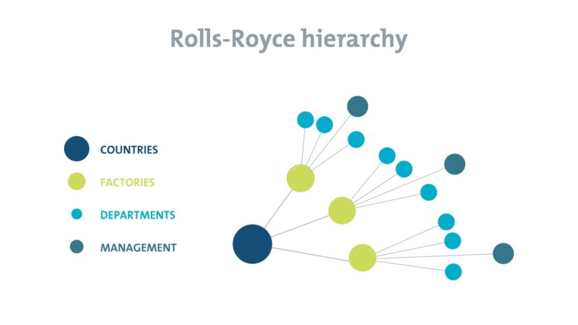
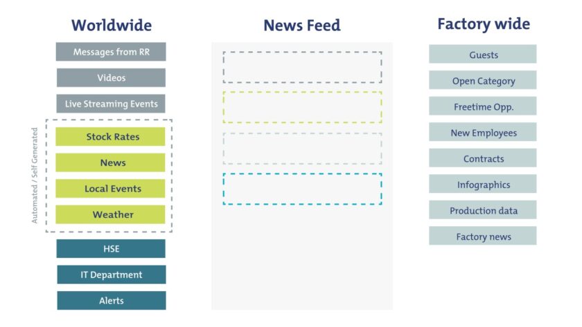
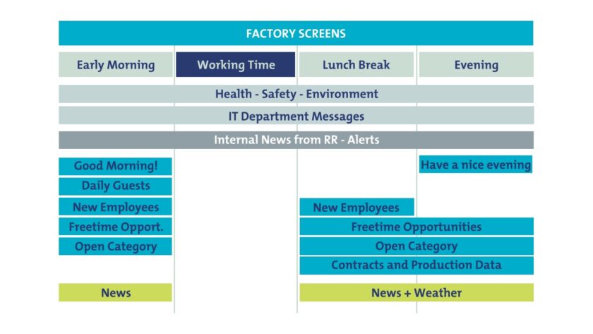
- We scaled our system on a worldwide hierarchy of locations and people, adding different categories catered for the specific departments and targets. We structure information to be displayed following a time schedule, increasing awareness and pushing employees to keep themselves updated by looking more often at the screens. Fewer messages per time, better focus.
- Bringing all the communication channels under one roof allow dissemination of information to all Rolls-Royce locations to stay connected and be in the loop of every relevant update happening around the globe.
Future perspectives in Human-Screen interaction
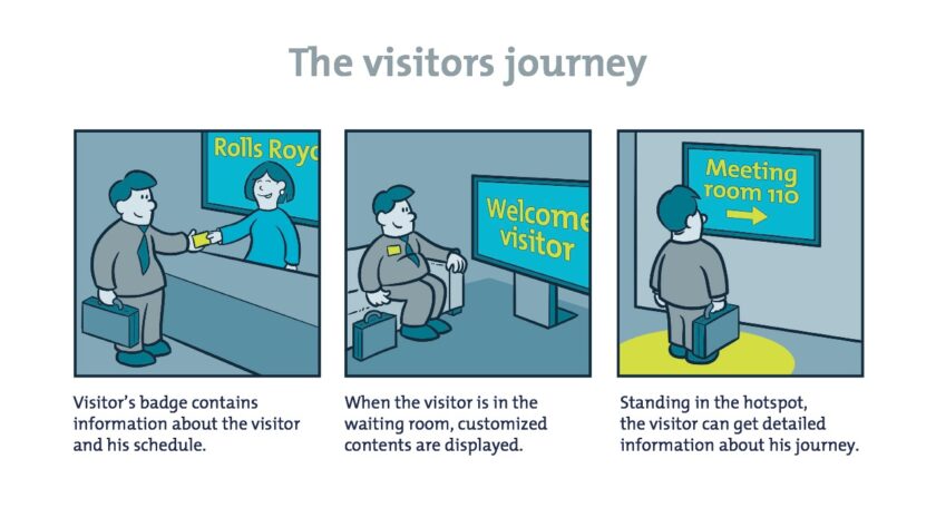
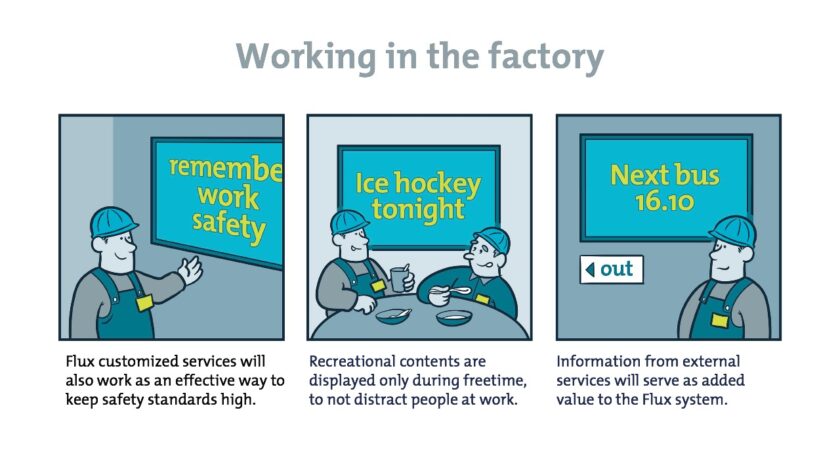
- Once the structure for the content flow was designed we started our interaction design journey, enhancing the technical capabilities and social functions of the screens.
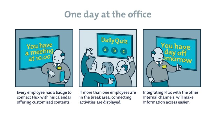
- Using RFID antennas and badges, each screen could intercept the person or group of people passing in front of it, providing person-targeted information to the viewer(s): agenda updates, wayfinding, entertainment opportunities.
- Our flow of ideas and visions about future implementations were stopped by the managers, as for them the privacy of their employees was the priority: tracking the positions of anybody wasn't feasible in the company.
🪄 Plot twists
- Tricking old system's static slides adding icons as index: a consistent list icons was placed at the bottom of each background image, highlighting the current one and following the order of categories, providing a an ordered structure and a time reference in the flow of information.
- Envisioning the system as a TV channel schedule, to display fewer contents per time, with frequent updates to the schedule, keeping engagement high without affecting productivities and avoiding distractions in workshops.
🍻 Failures and learnings
The biggest learning we got from this project occurred in the first phase of the project, when we were trying to get as much information as possible without being able to create a real engagement with the system manger.
Giving something back in this early stage, a simple visual redesign to the current system, made the added value of our work perceivable. This was also to be considered the main failure in our process: not realising it earlier.
Concerning the actual outcome and impact of our final solution, we don't have any data: the company decided to acquire all the rights of the project in order to continuing the development as an internal project, without our involvement.
